Element Queries

For a few years now we've been creating responsive websites. We do this with the famous media queries, and they are awesome. But what if we could do things a bit smarter, for instance with element queries? Let's dive into our current method first, media queries.
The media query
A media query can define a breakpoint. On a breakpoint we can change our design. In responsive design we usually work with height and/or width changes based on the viewport of our browser.
So let’s say we want the page to change on a minimum viewport width of 700 pixels. Most of the time we do this (Code is in SCSS):
.product-list li {
  float: left;
  width: 50%;
  padding: 10px;

  @media (min-width: 1000px) {
    width: 25%;
    padding: 20px;
  }
}
We use a module called .product-list. On mobile the product list has two items next to each other. When the width of the browser turns 1000 pixels, we’ll put four items next to each other and increase the padding. Awesome!
But the above happens if we’re going to put our product list in a small sidebar. They’ll still be standing next to each other. Ugly.
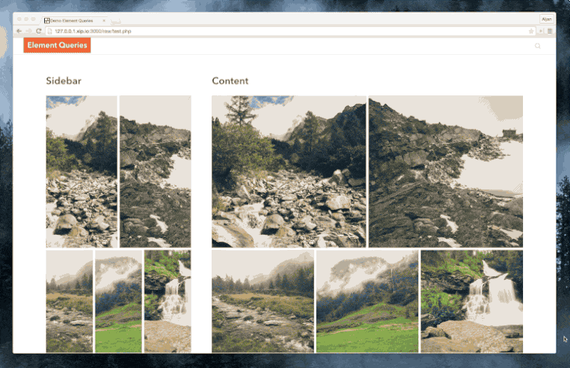
Element queries
With element queries we can adjust the module contents based on the width of the module instead of the width of the viewport like media queries.
Let’s get back to the product list. When the module is bigger than 1000 pixels we want the items to get a width of 25% and more padding, not when the viewport gets bigger than 1000 pixels. Like the example below.
.product-list li {
  float: left;
  width: 50%;
  padding: 10px;
}

.product-list[min-width: 1000px] li {
  width: 25%;
  padding: 20px;
}
This is awesome right? We can now build our modules to adjust to their own width and place them anywhere. In the main content, the sidebar and anywhere else. Especially for larger web apps this can be quite handy, because some modules should fit into different size panels.
Element queries should be combined with media queries. Use media queries for the layout rules or the grid and element queries for the individual modules and components. Otherwise it could be a complex job to get columns next to each other and the layout could fall apart. So they are actually good friends and not competitors.
Browser support & polyfill
None. It only works with a little bit of Javascript. For now you can use the polyfill by Marc Schmidt.
The future
I hope that element queries will work in native CSS within a few years. There are some challenges however. You can read more about them in the articles below.
- http://www.xanthir.com/b4VG0
- http://www.filamentgroup.com/lab/element-query-workarounds.html
- https://responsiveimagescg.github.io/eq-usecases/
— This post was originally written on the Studio Wolf blog.
Reageren? Leuk! Mag via Twitter of stuur me een mailtje.